• Android Studio
• Adobe Suite
In 2017, the landscape of online payments in our country was bleak. With no available online payment
app
nationwide, people relied on physical methods like ATMs or asking others for mobile recharges.
The mobile operator saw an opportunity to ease this burden and sought to develop an app allowing
clients
to recharge their balance and pay for home internet and landline services online.
• Limited availability of ATM top-ups and issues with cash acceptance.
• Overburdened mobile operator offices due to manual top-up processes.
• Congested home internet and landline providers’ offices, particularly at the beginning of each
month.
• Lack of online payment apps, leading to reliance on physical methods. (Believe it or not, in 2018,
we
were the first team to introduce an app featuring online payment functionality.)
• Limited familiarity with online payments, with many citizens possessing debit cards used solely
for
retail purchases.
 People waiting in the queue for mobile top-up
Create a simple app that would allow making online payments by adding any bank card. The app should
show
top-up options like mobile, internet or landline.
Here are some advantages it would provide:
• Saving your valuable time.
• Comfort and convenience of recharging anytime, anywhere.
• You don’t have to bother searching for a shop that provides scratch cards.
• You can recharge multiple mobile numbers.
• Recharging all types of mobile services in one place.
• Ability to see previous transactions with details.
• Brainstorming: Generate ideas and potential solutions to address user needs and pain points.
• Sketching: Create low-fidelity sketches and wireframes to explore design concepts and layouts.
• Prototyping: Build interactive prototypes to test and validate design ideas with users.
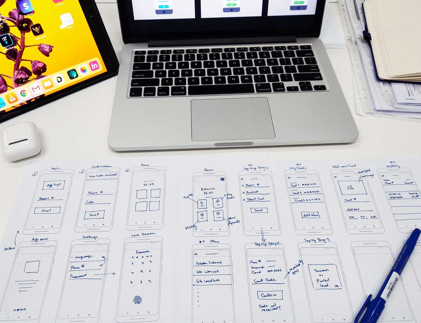 Paper prototyping is one of the fastest and cheapest techniques you can
employ in the design process.
From there, I began designing some screens to see where it takes me. I believe there's a constant struggle between prioritizing user-centered design and focusing on aesthetic appeal.
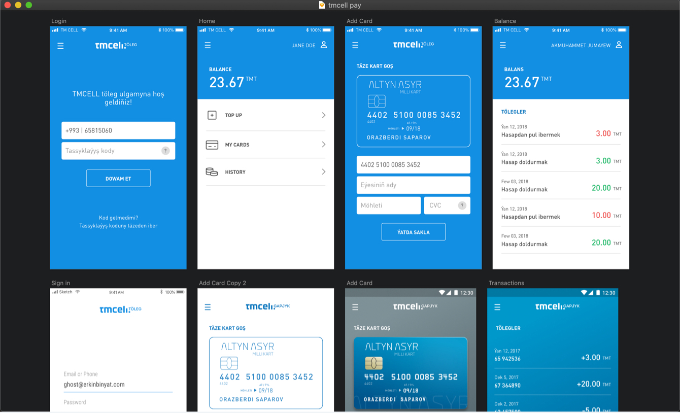 Some early screen designs of the app
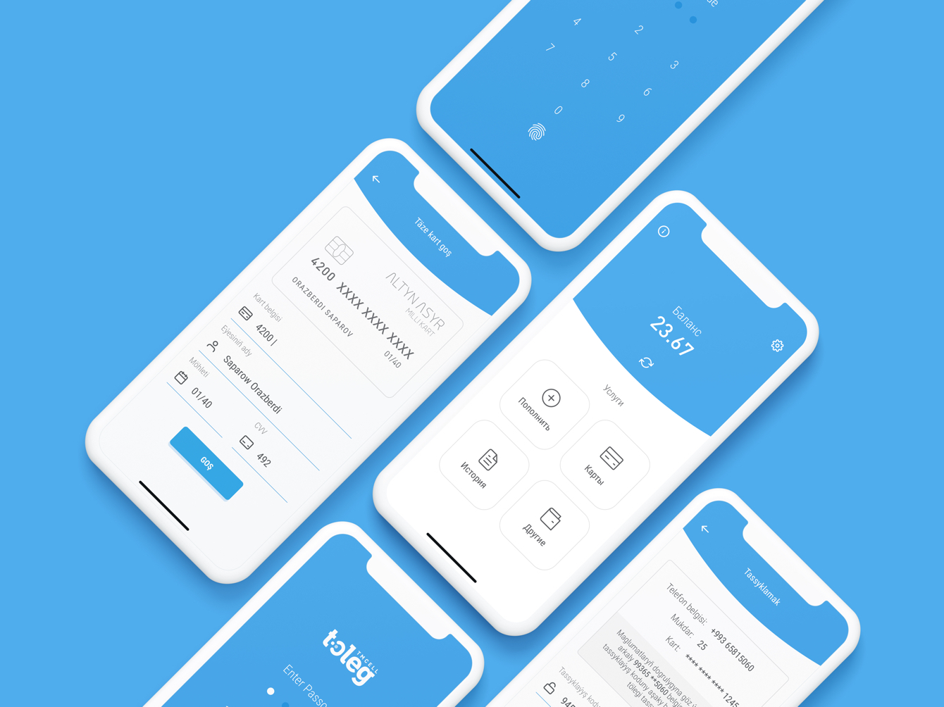 The first working version design of the app
Introducing the app effectively is crucial as users are hesitant to share their phone numbers
without
understanding the app's value proposition.
Recognizing that illustrating the payment process takes precedence over showcasing features, we
prioritized clarity in guiding users through their first online payment experience. This decision
stemmed from the realization that a significant portion of our potential users lacked prior
experience
with online payments.
When the project came our way, we faced a hurdle: none of our Android developers were available.
Given
my prior knowledge of Java, I stepped up to tackle the challenge of Android development.
Despite my limited experience with smaller personal projects, with the assistance of my colleagues,
I
successfully navigated the project from beginning to end.
"If you want something done, do it yourself" — Charles Guillaume Étienne
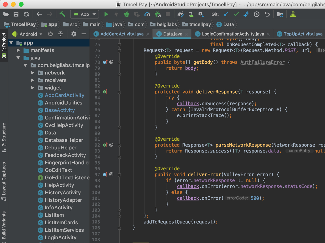 Why not put a screenshot of something not related to design?
Upon releasing the app, users began reaching out due to various issues encountered during its usage.
Some struggled to receive verification SMS, while others were uncertain about locating the
expiration
date of their card. Additionally, some users failed to grasp the app's purpose altogether.
These insights from user experiences provided valuable feedback for refining our business approach
to
better meet their needs.
Consequently, we implemented a feedback button on the home screen of the app. Furthermore, we
incorporated predefined options for common problems and errors to streamline the feedback process
for
users.
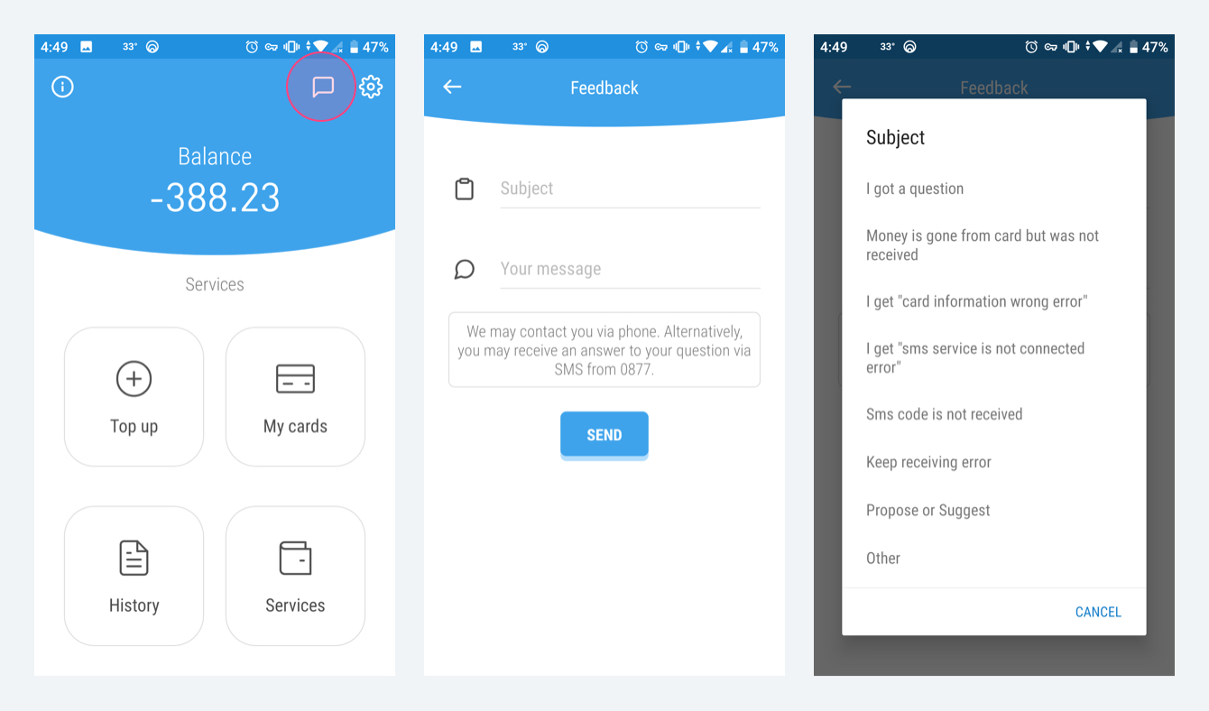 Feedback screens
The help center read all feedback messages coming from the users on the dashboard and promptly
reached
out to assist via phone calls or SMS messages.
Following the implementation of the feedback button, we witnessed a remarkable outcome:
transactions
nearly doubled, highlighting the significance of actively engaging with user feedback in
enhancing the app's performance and user experience.
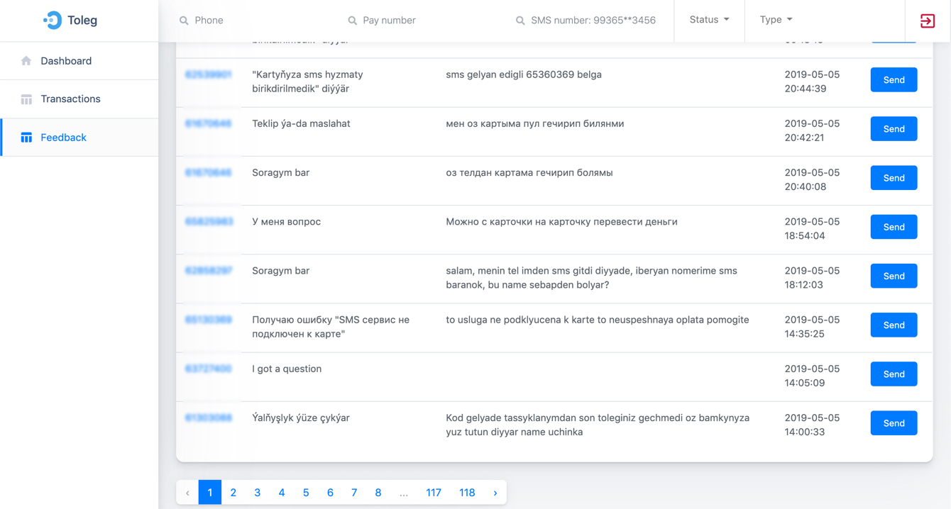 Customer Services's Admin dashboard
During the 2018 World Cup finale, we aired a "lower-third" commercial on television to increase brand awareness. Despite being a bit intrusive, it was highly effective.
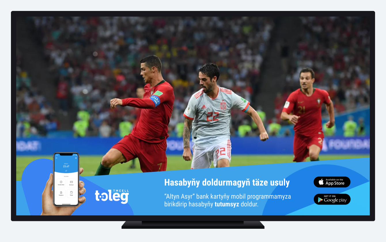 Apps “lower-third” ad design
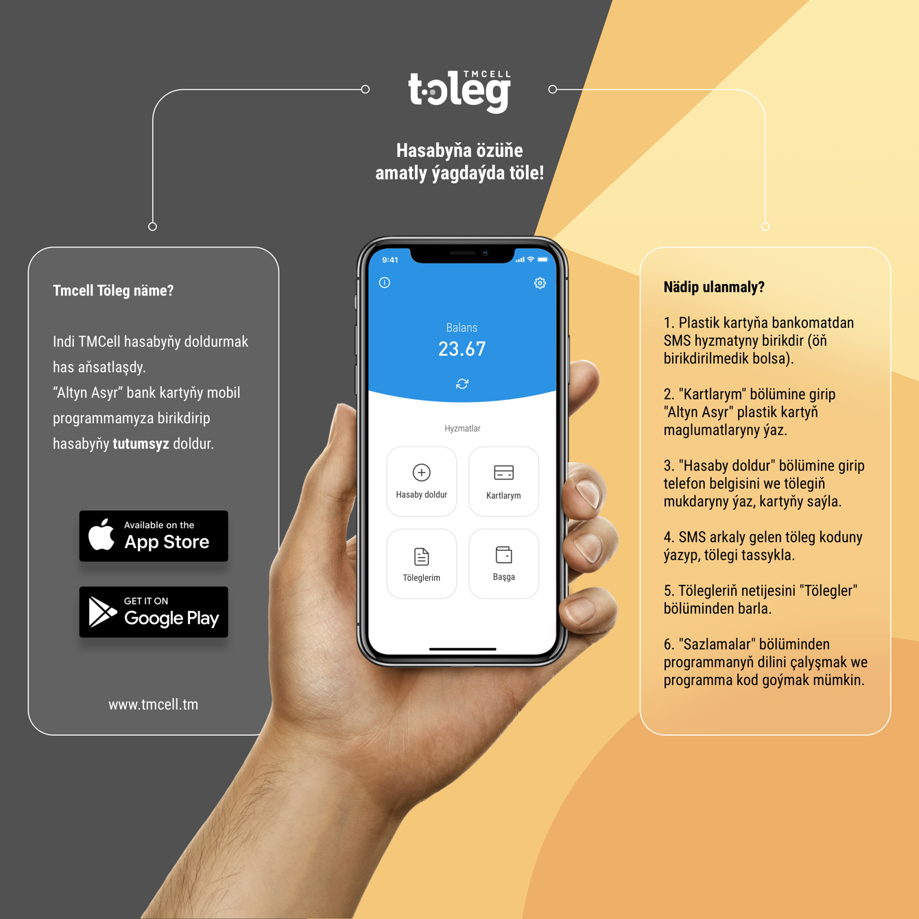
Due to the expansion of service payments within the app, the old version became non-scalable.
Consequently, we opted to redesign the app.
However, retaining familiarity for existing users was paramount. Thus, we aimed to preserve
most
elements while enhancing scalability and functionality.
As we embarked on redesigning the app, we encountered several challenges:
Balancing Familiarity and Innovation: Striking a delicate balance between introducing new
features and preserving the familiar interface to avoid alienating existing users.
Ensuring Compatibility Across Platforms: Addressing compatibility issues to ensure the
redesigned
app functions seamlessly across various devices, operating systems, and screen sizes.
Seamless Data Migration: Safely transferring user data and preferences from the old version
to
the redesigned app without compromising data integrity or user experience.
Complex Integration of Additional Services: Integrating new service payment options without
introducing technical complexities or performance issues.
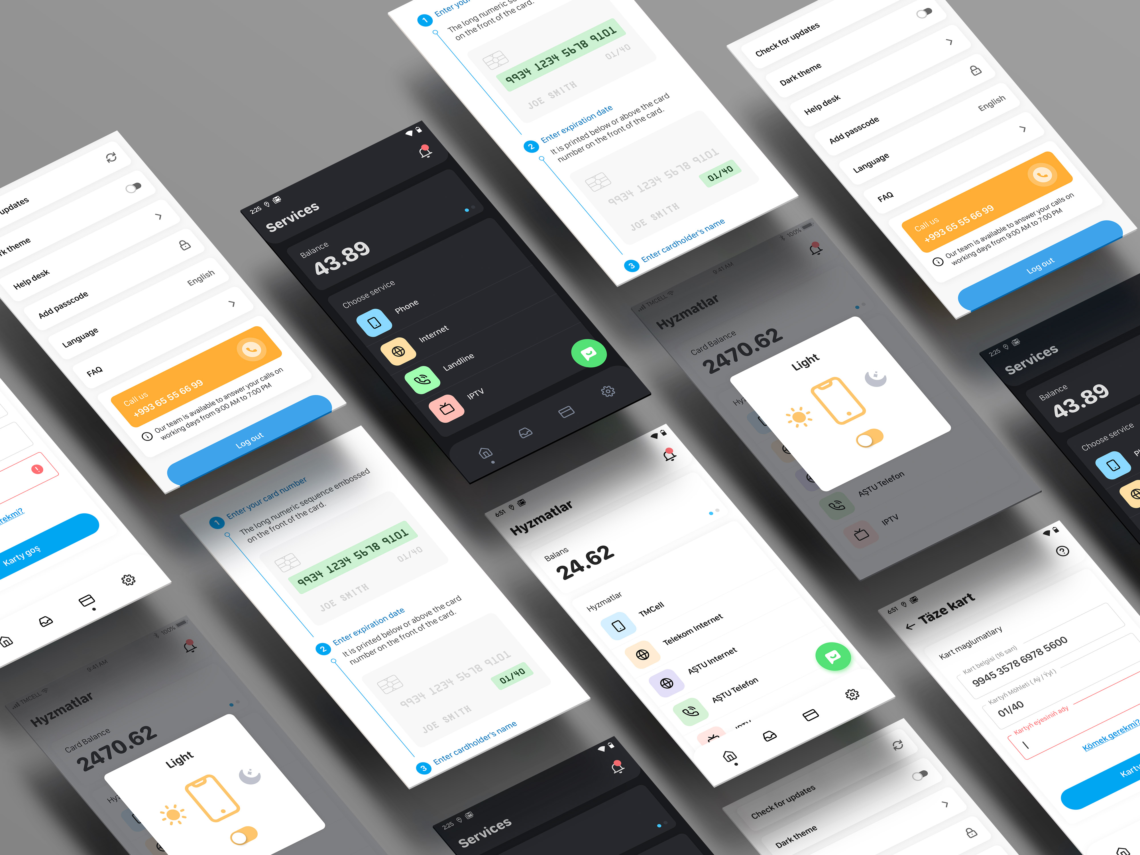 Some of the redesigned app screens
Total users: 1 000 000 +
Daily average new users: 500
Daily average active (with successful transaction) users: 30k
Monthly average active(with successful transaction) users: 250k
Daily average transactions: 150k-160k
Daily average successful transactions: 80-90k
Total transactions to this day: 100 million ~
You can check the app in the App Store and Google Play.